Differently-abled people are quite clever when it comes to work-arounds just to get through their everyday lives. There are times, though, when a work-around doesn’t work.
When it comes to technology (or anything else), a disability should not limit someone from having the same access to information as anyone else—and the U.S. Department of Education’s Office for Civil Rights agrees.
Why Accessibility Matters
In the past few years, higher education has experienced a dramatic increase in legal action towards colleges and universities with non-ADA-compliant websites. Faced with stiff fines, schools have been working feverishly toward digital compliance, but in the process have discovered that eliminating accessibility barriers benefits all people who visit your website.
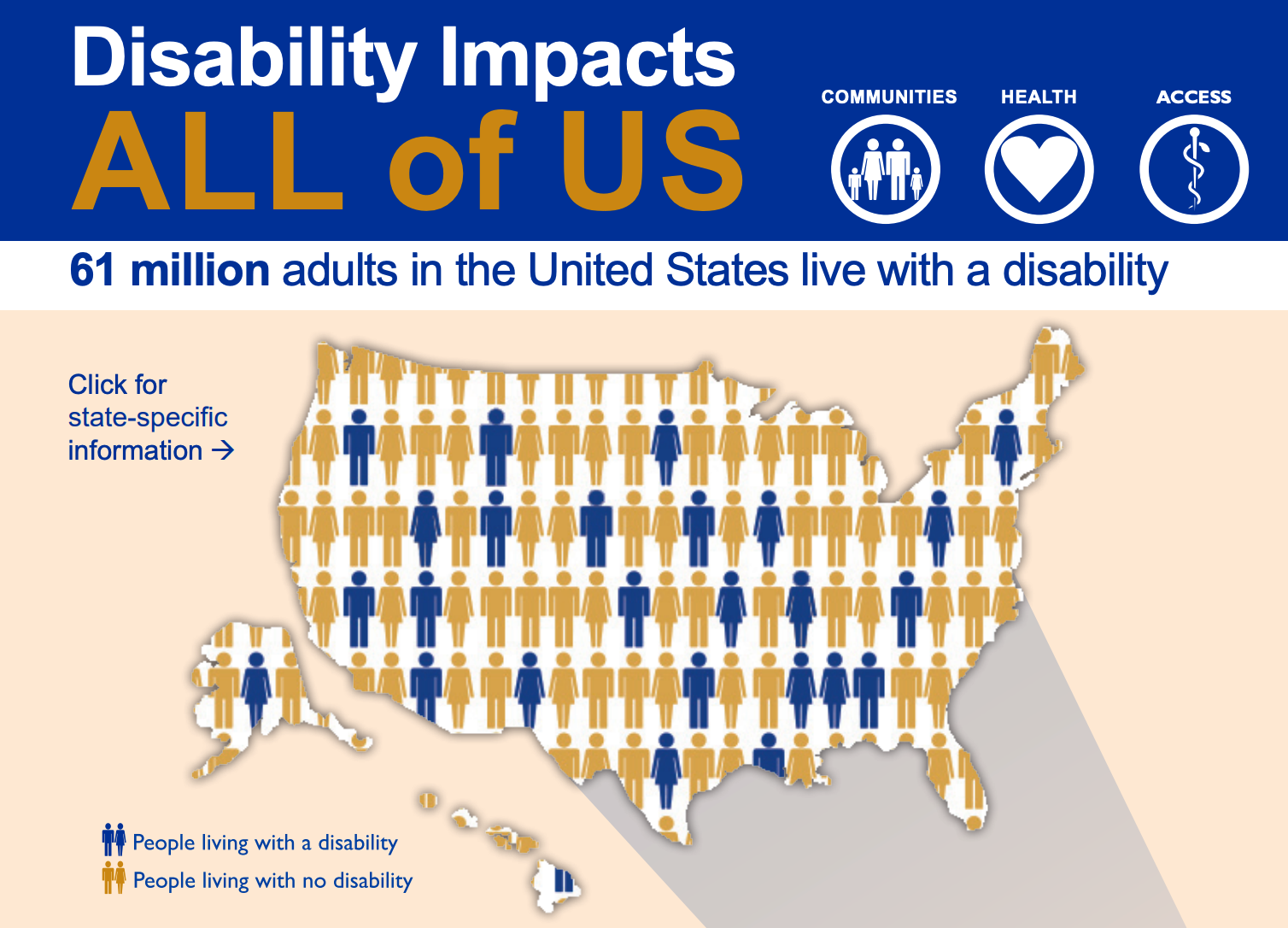
What’s more, 61 million adults in the U.S. have some type of disability, so when your website is fully compliant, the size of your audience increases. This is especially important if you use forms to gather information and feedback.

Related: Are your forms WCAG and Section 508 compliant?
Are your website forms accessible?
Making website forms accessible requires implementing editorial and design standards that boost user experience for differently-abled people. WebAIM is a good resource for guiding you down the road to accessibility, and you can also download The Complete Guide to Digital Accessibility Compliance for Colleges and Universities for specific information on higher education compliance.
Following the lead of higher ed, the best place to start is with a form structured to improve conversions. With a solid foundation, you can then address accessibility issues.
To get a jump on form accessibility, start with these five tips:
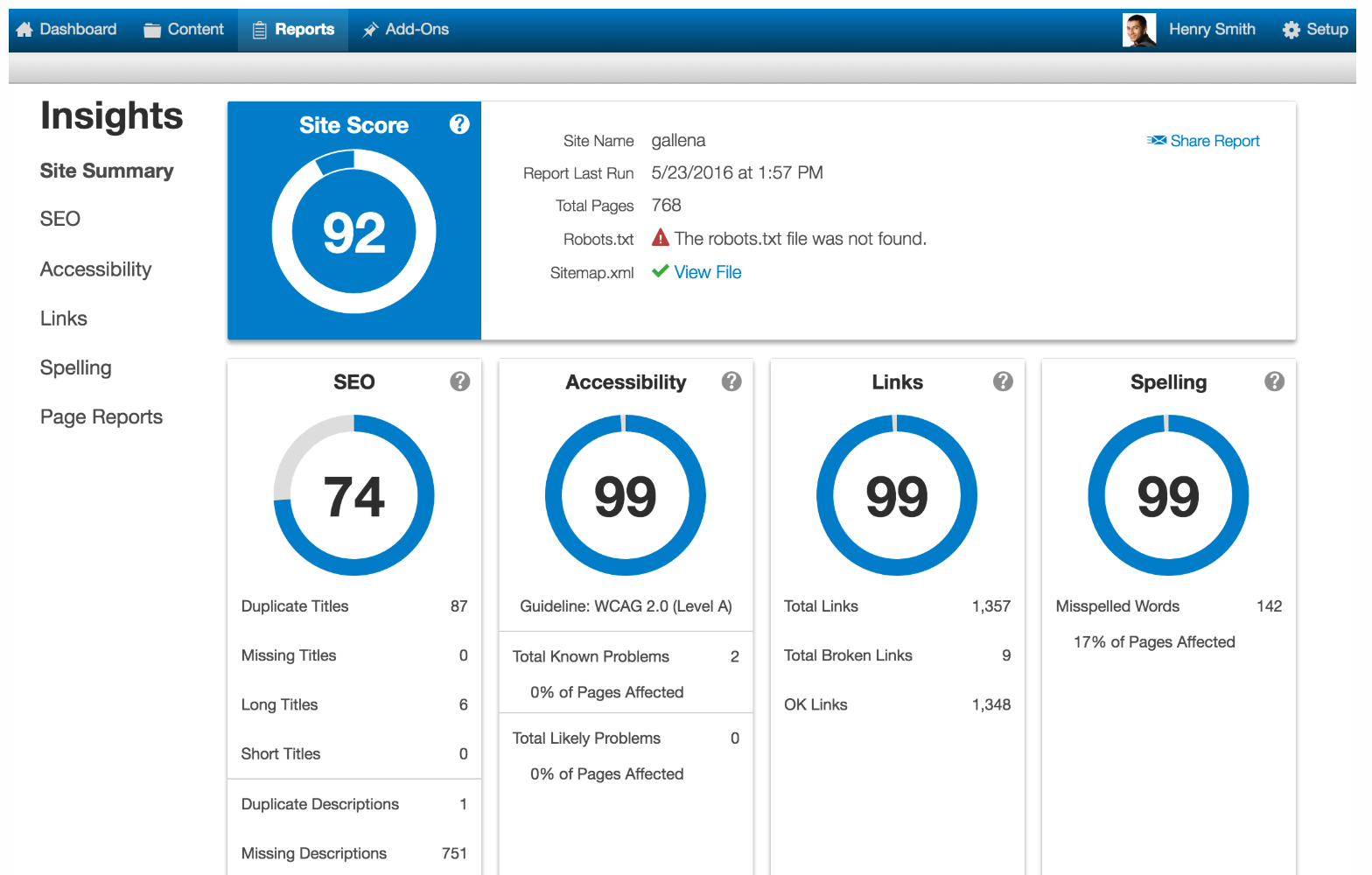
1. Perform an audit of your website with OmniUpdate’s free website.
accessibility scan to check pages for accessibility. As a bonus, it also checks for link, spelling, and SEO issues, too. Likewise, run the WAVE Web Accessibility Evaluation Tool to evaluate individual pages for accessibility issues. These scans will help you identify issues that both your website forms and general website pages have in relation to accessibility, giving you a starting point for your accessibility remediation.

2. Provide overall instructions that apply to the entire form.
The easier it is for your audience to understand why they should complete a form and how to complete it, the greater the chance of receiving a larger response. Keep in mind that instructions may be read aloud by screen readers, so be as thorough as possible.
3. Label each individual field in the form.
Form instructions will tell the user how to complete a specific field. Best practices suggest providing additional instructions underneath form fields. For example, if your form field is “phone number,” you may want to include “Please include area code” as additional instruction. If you do this, make sure you format the instructions appropriately so that they will be read by a screen reader.
4. Include placeholder text.
Placeholder text is the text that appears inside the actual form field to provide the user with examples of what to input into the form. It is usually in a lower contrast color and disappears once the user inputs information into the field. For example, in the email form field, you might include a sample email address.

Pro Tip: It’s important to note that placeholder text should not replace form field labels. Also note that while this is best practice, many older screen readers do not support placeholder text.
5. Do away with time limits on forms.
People with cognitive and dexterity issues may need more time to complete a form, so make sure you include an option that allows a user to turn off a time limit or extend it. This restriction doesn’t apply if the form is associated with a live event such as an auction or an online workshop.
Next Step: Create a Digital Accessibility Plan
These tips address immediate changes you can make regarding form accessibility, but your organization should also be considering a digital accessibility plan to ensure compliance for future forms and digital information. Like an editorial style guide, a digital accessibility plan provides content contributors with guidelines for posting accessible content. Even if you are not in higher education, a look through the schools’ accessibility plans below will give you ideas on how to structure one for your organization and what information should be included.
- California State University System
- Davidson University
- University of Minnesota
- Penn State University
- University of Washington
- Stony Brook University Libraries
- Harvard University
- University of Georgia
Remember, the ultimate goal for your website is accessible to all. Ensuring that your forms are accessible creates engagement and provides an interactive way for all users to communicate with your organization.
About the Author

OmniUpdate is the definitive partner of choice among web content management system (CMS) providers in higher education. Backed by award-winning training and support, OmniUpdate’s OU Campus® CMS is the easiest to use with features and modules designed to meet higher ed’s unique needs.


